
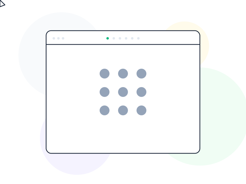
Gestalt principles in UX design are a set of perceptual rules that describe how humans naturally group and interpret visual information – understanding them helps you create interfaces that feel intuitive because they work with the brain’s built-in pattern recognition, not against it.
Why It Matters
The human brain is a pattern-matching machine. It constantly tries to organize what it sees into meaningful wholes rather than processing every individual element independently. Gestalt psychology, developed in the early 20th century, identified the rules that govern this process – and those rules turn out to be directly applicable to interface design.
When you place related items close together, users automatically perceive them as a group. When elements share color or shape, users assume they behave similarly. These perceptual shortcuts reduce the cognitive load required to understand an interface – users don’t have to consciously analyze the structure; their visual system infers it. Good layout exploits this; poor layout fights it.
Understanding Gestalt also makes it easier to diagnose why an interface feels “off” without being able to articulate exactly what’s wrong. If users consistently misgroup elements, or miss a relationship between two things that should feel connected, a Gestalt principle is usually at play.
How It Works / The Six Principles
Proximity: Elements placed close together are perceived as belonging to the same group. A button placed immediately beneath a form field is understood as that form’s submit action. Two blocks of text separated by whitespace feel like separate sections. Distance communicates relationship.
UI example: In a settings panel, grouping related toggles with tight spacing and separating unrelated ones with visible gaps creates implicit categories – without requiring a header for each group.
Similarity: Elements that share visual attributes (color, shape, size, style) are perceived as related. This is why all primary buttons in an interface should look identical – users learn that “blue filled button = primary action” and apply that understanding across every screen.
UI example: Graying out inactive menu items signals their different status through dissimilarity – users immediately understand they can’t interact with them, without reading any label.
Continuity: The eye follows paths, lines, and curves through a design, preferring smooth over abrupt directional changes. A row of product cards implies continuation – users expect to scroll right to find more.
UI example: Progress indicators work because of continuity – a horizontal bar leads the eye from left to right, implying movement toward a destination.
Closure: The mind fills in missing information to complete familiar shapes. Incomplete circles, partially visible elements, and cut-off content all suggest there’s more to see.
UI example: Cards that are partially cropped at the edge of a carousel signal “there’s more here” without explicit arrows or indicators – the visible edge of the next card does the work.
Figure-Ground: The brain distinguishes between a focused subject (figure) and its background (ground). Modals work because they create a clear figure (the dialog) against a dimmed ground (the page beneath). Without this distinction, interfaces feel flat and directionless.
UI example: Dropdown menus rely on figure-ground – the menu card floating above the page needs sufficient shadow or border to clearly read as foreground.
Common Region: Elements enclosed within the same boundary (a box, card, or background color) are perceived as a group, even if they’re not tightly spaced. Cards are almost entirely a common region device – they gather related information into a perceived unit.
UI example: A product card groups image, title, price, and rating together not because they’re tightly spaced but because they share a bordered container.
Real-World Example
Spotify’s playlist and album grid demonstrates proximity and similarity working in tandem. Each album card (square image, title, artist) is a common region grouping. The consistent card format across all items uses similarity to signal “these are all the same type of thing.” Even grid spacing uses proximity to prevent any accidental grouping between rows or columns.
When Spotify breaks this grid with a featured playlist in a larger or different format, it uses contrast against the established Gestalt norms to draw attention – the disruption of the pattern is precisely what makes it noticeable. The principles govern both the consistency and the strategic breaks from it.
How to Apply
- Use proximity to replace explicit labels. Before adding a section header, try grouping elements with spacing. If the grouping is clear without text, the label is noise.
- Enforce similarity for interactive elements. Audit every button, link, and input in your UI. Elements that behave the same should look the same. Visual inconsistency implies behavioral inconsistency.
- Apply common region with restraint. Cards and containers create strong groupings, but over-boxing fragments the layout. Use containment for genuinely distinct groups, not for decoration.
- Use closure to indicate scrollability. Intentionally crop the last visible element in a horizontal or vertical list to signal that more content exists beyond the visible area.
- Test your figure-ground hierarchy. Squint at your design. What stands out? What recedes? If the background competes with the foreground, your modals and dropdowns will feel ambiguous.
Common Mistakes
Proximity without intention. Placing elements close together by accident – because “there wasn’t much space” – creates false groupings that users have to mentally undo. Every spacing decision implies a relationship decision.
Inconsistent similarity across components. When a primary button appears in three different colors across an app, users lose the ability to rely on similarity as a signal. Pattern consistency is a design contract with your users, and breaking it has a real cost.
Over-relying on explicit labels. If an interface needs a label to explain every grouping, it’s working against Gestalt rather than with it. Well-applied proximity, similarity, and common region should make many labels redundant.
Related Concepts
- Mental Model – the internal expectations that Gestalt principles either confirm or violate
- Cognitive Load – what Gestalt principles reduce when applied correctly
- Affordance – how visual similarity signals what an element does
- Information Architecture – the structural layer that Gestalt makes visually perceivable
- Color Theory – the visual dimension most closely connected to the similarity principle