
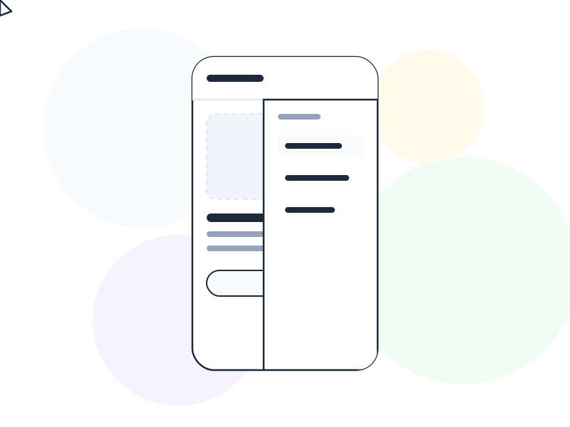
A hamburger menu in UX is a navigation element represented by three horizontal lines (☰) that, when tapped or clicked, reveals a hidden navigation drawer or menu – widely used to save screen space on mobile, and widely criticized for hiding navigation that users need to discover.
Why It Matters
The hamburger menu is one of the most debated patterns in UX. It solves a real problem – mobile screens are small, and navigation menus with five or more items don’t fit gracefully in a top bar. The three-line icon is space-efficient and has become recognizable enough that most users understand it opens a menu.
But recognition doesn’t equal usability. Research consistently shows that navigation hidden behind a hamburger icon gets used less than navigation that’s immediately visible. “Out of sight, out of mind” isn’t a metaphor here – it’s a measurable effect on engagement, task completion, and feature discovery. When users can’t see navigation options, they assume fewer options exist or struggle to find what they’re looking for.
This tension – space efficiency versus discoverability – is what makes the hamburger menu UX debate productive. The answer isn’t “never use it” but “understand what you’re trading off and use it deliberately.”
How It Works
The standard implementation: a ☰ icon (three horizontal lines, sometimes with a label like “Menu”) sits in the header, typically top-left or top-right. Tapping it reveals a navigation panel – either a full-screen overlay, a slide-in drawer from the left or right, or a dropdown list.
The icon itself has no inherent affordance – its meaning is entirely learned. This is why some teams add a “Menu” text label alongside the icon, which research shows significantly improves discoverability, especially for less tech-savvy users.
From an accessibility standpoint: the toggle button must have an accessible name (aria-label="Open navigation menu"), the expanded/collapsed state must be communicated (aria-expanded), and keyboard navigation must work (Escape to close, Tab to move through items). These requirements are straightforward but frequently neglected.
Pros and Cons
Why teams use it:
- Saves significant header space on mobile, keeping the primary screen area focused on content
- Works well for secondary or utility navigation (account settings, help, logout) that users access infrequently
- Clean, minimal appearance that doesn’t compete with the main content
Why it hurts usability:
- Navigation items are completely invisible until the menu is opened, which reduces their usage significantly
- Requires an extra tap before users can navigate anywhere – in high-frequency navigation contexts, this friction compounds
- The icon lacks inherent meaning for less experienced users, especially without a text label
- Hick’s Law effects are masked but not eliminated – a hidden menu with 20 items is still a menu with 20 items
Alternatives Worth Considering
Tab bar (bottom navigation): Shows 4–5 primary navigation items persistently at the bottom of the screen, within thumb reach. Dominant on iOS and increasingly common on Android. Research shows tab bars significantly outperform hamburger menus for primary navigation frequency and task success.
Priority+ pattern: Shows as many navigation items as the available width allows, hiding overflow into a “More” dropdown. Adapts to different screen widths without sacrificing discoverability for the most important items.
Bottom navigation drawer: A persistent bottom bar with a few primary items plus a “More” option that expands a sheet with secondary items. Balances visibility with space efficiency.
Icon-only sidebar (desktop): Works for dense applications (analytics dashboards, productivity tools) where users learn the icon set. Requires tooltip labels for discoverability on first use.
When the Hamburger Menu Is Valid
The hamburger menu makes sense in specific contexts:
- Secondary or utility navigation – items users access occasionally (profile, settings, help, logout) don’t need constant visibility. Hiding these behind a hamburger is an appropriate application of progressive disclosure.
- Desktop sidebar toggle – collapsing a sidebar to maximize content area on smaller screens (common in dashboards and content editors) is a legitimate use case where the three-line icon has become the established convention.
- Supplementary navigation alongside a persistent tab bar – Spotify’s approach: primary sections in the tab bar, everything else (settings, account, help) in the hamburger menu.
Real-World Example
Spotify’s mobile app illustrates the right balance. The bottom tab bar carries the four primary navigation destinations users need constantly: Home, Search, Your Library, and (previously) Premium. The hamburger/profile icon in the top corner leads to account settings, playback settings, and support.
The logic is deliberate: if you need to listen to music, you never need to open the hamburger. If you need to change your account password, you don’t need to do it while watching the navigation bar. The split matches navigation frequency to visibility. Primary tasks are always visible; infrequent utility tasks are one tap away.
How to Apply
- Never put primary navigation in a hamburger menu on mobile. If users need it to complete their main tasks, it should be visible. Use a tab bar or persistent top navigation for primary items.
- Add a “Menu” text label to the ☰ icon. Research shows this simple addition significantly improves discoverability, especially for users over 40 and those less familiar with mobile conventions.
- Apply Fitts’s Law to placement. If you must use a hamburger, bottom-right or bottom-left placement puts it within thumb reach on large phones. Top-corner placement requires an uncomfortable stretch.
- Ensure full keyboard and screen reader support.
aria-label,aria-expanded, Escape to close, and Tab-navigable menu items are non-negotiable for accessibility. - Track engagement with items inside the hamburger. If an item is being used heavily by users who manage to find it, it belongs in primary navigation – not hidden behind three lines.
Common Mistakes
Putting primary navigation in a hamburger “to keep things clean.” Clean at the cost of discoverability is a design failure, not a design choice. A tab bar with four items isn’t cluttered – it’s functional.
No keyboard navigation or screen reader support. A hamburger menu that can only be operated by touch is inaccessible to keyboard users and users with motor impairments. The ARIA implementation is well-documented and there’s no excuse to skip it.
Using it on desktop without an alternative. On desktop, hiding primary navigation in a hamburger menu provides the space savings of a mobile pattern without the justification – desktop screens have room for persistent navigation. Reserve desktop hamburgers for sidebars and secondary panels.
Related Concepts
- Navigation Pattern – the full landscape of navigation structures hamburger menus fit within
- Progressive Disclosure – the principle the hamburger applies to navigation content
- Hick’s Law – why hiding many options doesn’t eliminate their cognitive cost
- Fitts’s Law – why placement of the toggle icon matters on mobile
- Accessibility – the ARIA requirements that make hamburger menus usable for everyone