
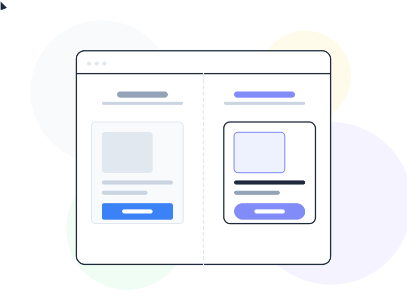
A microinteraction UX design pattern is a contained, single-purpose interaction moment – a toggle switching on, a like button animating, a progress indicator spinning – that provides feedback, communicates state, and makes an interface feel responsive and alive without requiring any conscious user attention.
Why It Matters
Interfaces without microinteractions feel flat. When a user taps a button and nothing happens for 200ms, they tap again. When a toggle switches silently with no visual confirmation, they’re unsure if it registered. When a form submits without any transition, the next state feels jarring and unexplained. Microinteractions solve these problems at the smallest possible scale.
The value isn’t aesthetic – it’s functional. Microinteractions communicate that the system is working, that an action was registered, that a state has changed, and what the current state is. They answer the user’s most fundamental question – “did that work?” – before the user consciously asks it.
Done well, microinteractions also create the sense of quality and care that users describe as a product feeling “polished.” The difference between a functional interface and a delightful one is often a collection of small moments that each take only milliseconds but collectively communicate that a team thought carefully about the experience.
How It Works / Dan Saffer’s Structure
Dan Saffer’s book “Microinteractions” (2013) formalized the framework that remains the standard mental model for designing them. Every microinteraction has four components:
Trigger initiates the microinteraction. Triggers can be user-initiated (a tap, click, gesture, or voice command) or system-initiated (a notification arriving, a download completing, a connection dropping). The trigger determines what initiates the response and under what conditions it fires.
Rules define what happens when the trigger fires. Rules are the invisible logic layer: if the user taps the like button and it’s not already liked, add a like and play the animation. If it’s already liked, remove the like and reverse the animation. Rules determine the behavior and handle edge cases (what if the user is offline? what if the action fails?).
Feedback is the visual, auditory, or haptic response that communicates what happened. Feedback is what users actually perceive – the animation, the sound, the vibration, the color change. Good feedback is proportional to the significance of the action: a like button warrants a small animation; a file deletion warrants a more prominent confirmation.
Loops and modes define how the microinteraction behaves over time. Does it repeat? Does it change after it’s been triggered a certain number of times? A progress bar that loops while downloading is a loop. A “muted” mode that changes all subsequent notification microinteractions is a mode.
Types of Microinteractions
System status feedback: Spinners, progress bars, skeleton screens, and loading states tell users something is happening and roughly when it will complete. Without these, users interpret silence as failure and retry actions that are already in progress.
User input feedback: Visual confirmation that an input was received – a button depressing on tap, a checkbox checking with a small animation, a text field highlighting on focus. These close the perceptual feedback loop between user action and system response.
Navigation transitions: Animated transitions between screens or states that communicate spatial relationships. A new screen sliding in from the right suggests forward navigation. A card shrinking into its originating thumbnail tells users where to find it again. These are microinteractions serving interaction design’s goal of communicating spatial context.
Data input confirmations: The green checkmark that appears when a password meets requirements, the real-time character count below a text field, the inline validation that marks a correctly formatted email. These reduce the cost of errors by catching them before form submission.
Ambient feedback: Background microinteractions that communicate ongoing states without interrupting the user – a wifi icon updating, a battery indicator changing, a sync status updating in a header.
Performance Considerations
Microinteractions must not slow the interface. An animation that runs during a network request and extends the perceived loading time is counterproductive. Microinteraction animations should run at 60fps (16ms per frame) and complete in 100–300ms for most feedback responses. Longer animations (300–500ms) are appropriate for significant state transitions; anything over 500ms feels slow.
CSS transitions and transforms are hardware-accelerated and should be the default tool. JavaScript-based animations are appropriate for complex sequences (Dan Saffer’s “loops”) but require careful performance profiling, especially on mid-range Android devices.
Accessibility
The prefers-reduced-motion CSS media query allows users who are sensitive to motion – including users with vestibular disorders – to signal that they prefer reduced animation. Microinteractions that include significant movement should respect this preference:
@media (prefers-reduced-motion: reduce) {
  .animated-element {
    animation: none;
    transition: none;
  }
}
This is not an optional enhancement – it’s an accessibility requirement for WCAG 2.1 Success Criterion 2.3.3 (AAA) and a best practice for WCAG 2.1 Level AA compliance. Removing animations for users who need reduced motion doesn’t degrade the microinteraction; it ensures the underlying state change still communicates correctly through non-motion means (color change, icon swap, text update).
Microinteractions that rely exclusively on color to communicate state changes also fail users with color blindness. Pair color changes with icon changes, text updates, or pattern changes to ensure the state is communicated through multiple channels.
Real-World Example
Facebook’s like button is one of the most analyzed microinteractions in design history. In its original form, clicking “Like” produced a simple state change – the count incremented, the button changed to blue. In 2016, the reaction system was introduced: pressing and holding the like button triggered a small tray of emoji reactions to appear.
The trigger (long press), rules (hold = expand reactions, release = select), feedback (emoji animations at selection, count updating), and mode (your reaction persists and changes the subsequent microinteraction when you re-engage) all follow Saffer’s structure precisely.
More instructively, the original like button’s microinteraction – the small animation of the thumb icon and the number incrementing – was specifically designed to feel satisfying. The timing, the scale change, and the color transition were tested and iterated on until the tap produced an emotional response proportional to the social act of endorsing someone’s content. That deliberateness is the difference between a functional state change and a microinteraction.
How to Apply
- Map every state change in your interface. Every toggle, button, form field, and loading state is an opportunity for a microinteraction. Inventory what currently has feedback and what doesn’t. Silent state changes are gaps.
- Design feedback before designing animation. Ask: what does the user need to know? Then ask: what’s the simplest visual that communicates that? Animation should serve the communication, not the other way around.
- Use Saffer’s trigger-rules-feedback-loops framework as a spec tool. Writing out all four components for a complex microinteraction before implementing it surfaces edge cases (what happens on failure? what if it’s triggered twice quickly?) that visual design alone misses.
- Implement
prefers-reduced-motionfrom the start. Build reduced-motion alternatives alongside the animated versions, not as an afterthought. This is far faster than retrofitting it later. - Test microinteractions on real devices. What runs at 60fps on a development machine may drop frames on a mid-range phone. Profile animation performance on representative hardware before shipping.
Common Mistakes
Microinteractions for decoration rather than communication. An entrance animation that makes a page element bounce in on load doesn’t tell the user anything. It just delays when they can interact with it. Every microinteraction should answer a question the user has or confirm an action they took.
Ignoring prefers-reduced-motion. Vestibular disorders affect approximately 35% of adults over 40. Motion that feels pleasant to most users can cause nausea, dizziness, or disorientation in users with vestibular sensitivities. Respecting prefers-reduced-motion is both an accessibility obligation and a basic act of design empathy.
Microinteractions that outlast their usefulness. A “congratulations” animation on onboarding completion is appropriate the first time. The same animation on the fifth login is irritating. Consider loops and modes: how does the microinteraction change after it’s been experienced multiple times?
Related Concepts
- Interaction Design – the broader discipline that microinteractions operate within
- Affordance – how microinteractions reinforce what an element does by responding to interaction
- Accessibility – the requirements around motion sensitivity and color-only communication
- Progressive Disclosure – the principle behind microinteractions that reveal information only when triggered
- Onboarding – the context where celebratory microinteractions have the highest motivational impact